This page tool changes the direction, layout, and size of the page you are working on in InDesign. I think this tool would be beneficial when constructing projects, whether for business or artistic purposes; for example, pamphlets are vertical and a specific size rectangular, whereas creating something for visual art may be best used as a landscape layout. I also think this tool is super helpful since, in other applications like Photoshop or Illustrator, you have to choose the page layout before you even start working, but with InDesign, you really have the freedom to change it as you create. I really like this video made by Jawad Soomro because he is super straight to the point with his explanations and examples.
Rectangle Frame Tool:
This Rectangle Frame tool inputs images onto a page in InDesign. At first you use the tool to select an area where you want an image or picture to go. Then, once you import the image from your saved files, you can manipulate how it looks inside the previously selected area you chose with the tool. I will use this tool a lot since I will import images and videos onto my page/ project for examples of whatever topic I present through my InDesign art. I liked this video because the channel LYH Studio covers every detail you need to know. However, the tutorials are a little slow-paced, so I have to play with the playback speed on YouTube.
Pencil Tool:
The Pencil tool is pretty self-explanatory since it is quite literally a virtual pencil used to create drawings in InDesign. However, I really like that it has a sub-tool setting called Smooth Pencil Tool, which allows you to go into the details of your drawing and smooth out very specific areas that you select. This tool is going to be most helpful out of the other tools I have listed above since I am a very do-it-myself type of person, I would rather freehand draw what I want than try to manipulate lines with the Pen tool. I really like this video that Dansky made for beginners to understand the tools of InDesign since he does not over-explain and shows perfect examples of how to use the tools he is talking about. Overall, I would probably go to Dansky's YouTube channel for help in InDesign since he has the best technique for teaching virtually through a publicly accessible platform.
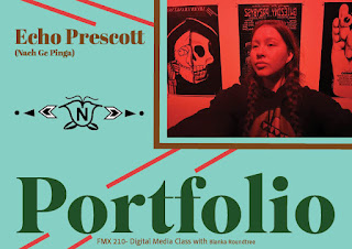
The art: The artist statement: The portfolio you just seen above is all my work I have created with much grace and sweat, and then curated together to become "professionally" presentable. I used Adobe's color palette on custom mode to perfectly pick out the correct colors that represented who I am as the artist which was turquoise (#7ADFCE) (a popular mineral used in Indigenous jewelry and regalia), dark green (#025000) for nature, then red (#DF3E3E), yellow (#E1D656), white (paper) from the medicine wheel, and dark brown (#7C4300) for a neutral color to match the rest of the color theme. The Adobe font "Superior Title" was my best friend in accomplishing a groovy, sophisticated look I wanted to show style but also professionalism. My body text is all Adobe's font of "Khmer MN" which isn't the original font I want ("Bebas Neue") but it did an alright job of a being a good body text since it is still readable and stylized to fit the...
The Sketches: The Business Cards: Artist Statement: The basis for my business cards is definitely encouraged by neon lights since I truly enjoy the over contrast that these colors bring to the viewer's eye. (NOT FINSHED YET)

Comments
Post a Comment