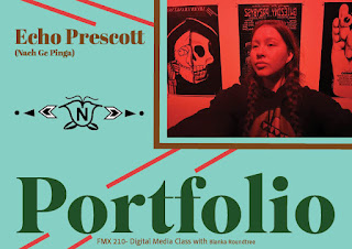
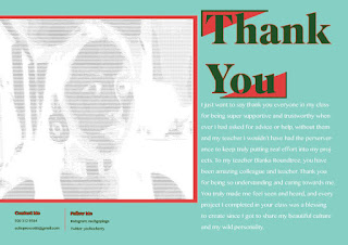
The Finale... ECHOS PORTFOLIO
The art:
The portfolio you just seen above is all my work I have created with much grace and sweat, and then curated together to become "professionally" presentable. I used Adobe's color palette on custom mode to perfectly pick out the correct colors that represented who I am as the artist which was turquoise (#7ADFCE) (a popular mineral used in Indigenous jewelry and regalia), dark green (#025000) for nature, then red (#DF3E3E), yellow (#E1D656), white (paper) from the medicine wheel, and dark brown (#7C4300) for a neutral color to match the rest of the color theme. The Adobe font "Superior Title" was my best friend in accomplishing a groovy, sophisticated look I wanted to show style but also professionalism. My body text is all Adobe's font of "Khmer MN" which isn't the original font I want ("Bebas Neue") but it did an alright job of a being a good body text since it is still readable and stylized to fit the portfolios theme. Overall, the theme of weirdo native pop is incredibly relevant in my portfolio and I know that anyone who sees this will think it is unconventional and doesn't necessarily fir the modern look of professional portfolios but I think it would be fake and plastic of me to make something that didn't represent me and who and I am.


Comments
Post a Comment